This week, I looked through a range of magazines to see how interviewers connect with their subjects and to get a sense of the different visual styles each publication uses.
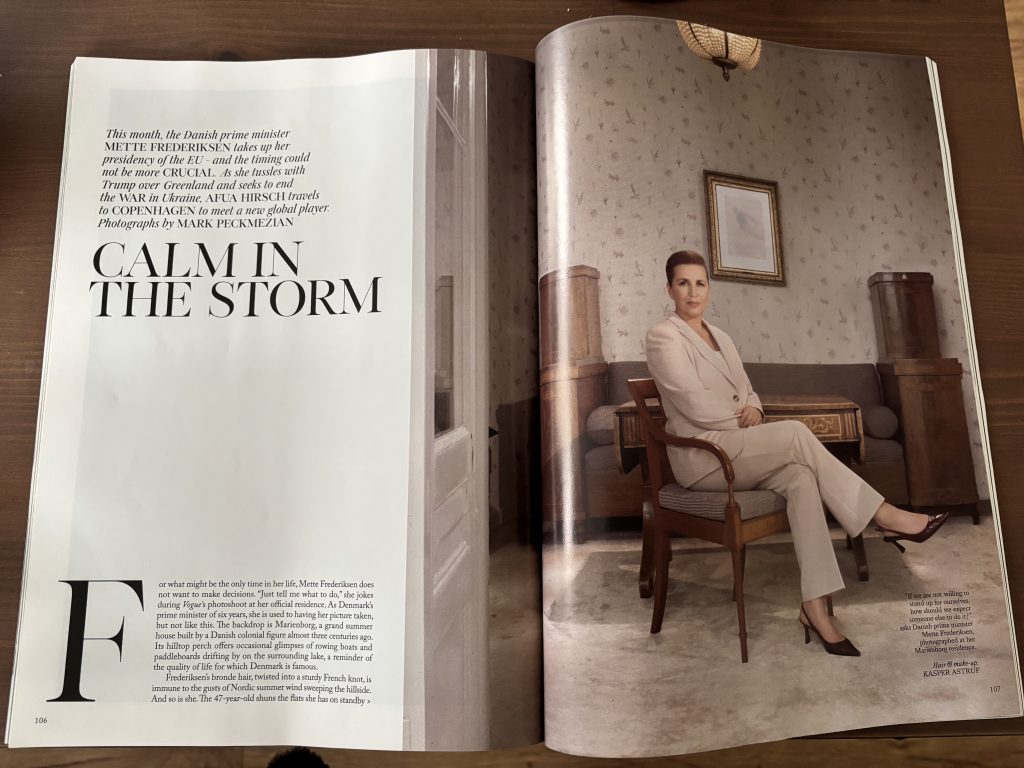
My first choice was Vogue, where I came across an interview with Mette Frederiksen, the prime minister of Denmark. The feature takes a story-based approach rather than a simple Q&A, using flowing, small text and integrated quotes to create a more narrative feel. The design reflects this tone—the title “Calm in the Storm” appears in elegant serif capitals, paired with a composed portrait that captures her calm authority. On the following pages, a bold pull quote uses capital letters for key words such as “NO CREDIBILITY”, “PEACE”, “TALKS”, and “DROPS”, drawing the reader’s attention and making the message more crucial and emotionally charged. The inclusion of a smaller, candid image of Frederiksen at a Pride event introduces warmth and approachability, offering a human balance to the formality of the main portrait as well as reflecting her beliefs clearly.
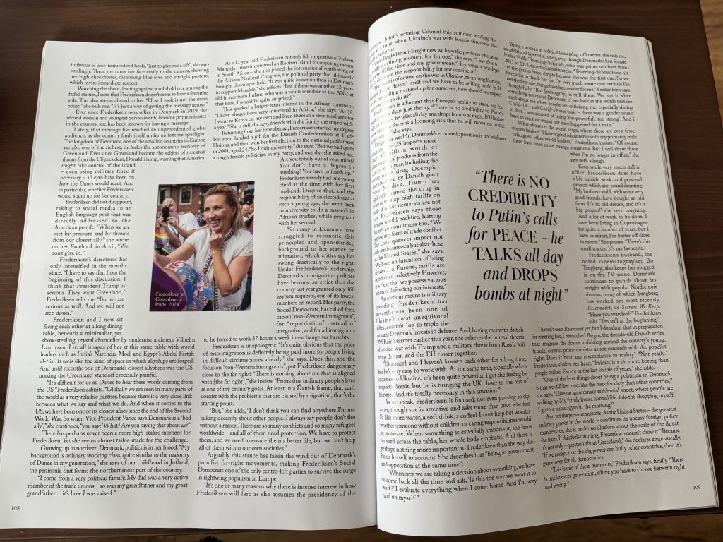
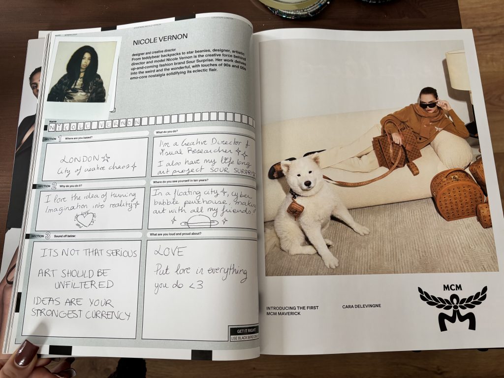
In contrast to Vogue’s polished, story-driven format, Dazed presents its interviews with more playful approach. In a series featuring emerging artists like Nicole Vernon and Filma Bidi, the magazine replaces the traditional question-and-answer layout with a handwritten questionnaire-style design. Each profile includes a Polaroid-taken portrait and hand-scrawled responses, giving the impression of flipping through someone’s sketchbook or diary. This format feels spontaneous and authentic, reflecting Dazed’s focus on youth culture, individuality and quirkiness. The rough handwriting, doodles, and casual tone turn each page into a visual expression of the artist’s personality, while the consistent structure across the series ties them together as part of a creative community. By giving equal importance to image, text, and layout, Dazed transforms a short conversation into a piece of visual storytelling — one that celebrates imperfection, imagination, and self-expression in a way that feels intimate.
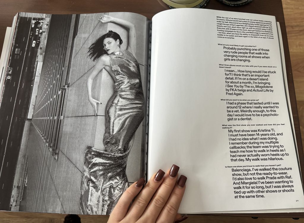
Another Dazed interview, this time with super-model Victoria Caretti, shows how the magazine adapts its visual language while keeping its distinctive focus on individuality. Unlike the handwritten artist questionnaires, this feature uses a minimalist Q&A format. Caretti’s answers appear in larger and bolder text than the interviewer’s questions, which immediately draws the reader’s eye and gives her words more weight. This layout choice visually communicates her presence and importance within the conversation — her perspective quite literally takes up more space on the page. I think that is a clever way of reinforcing Dazed’s ethos of empowering creative voices rather than editorial control.
Leave a Reply